

Dynamic Sales Manager specialized in overseas market expansion, high‑end client development, international‑client relationship maintenance .
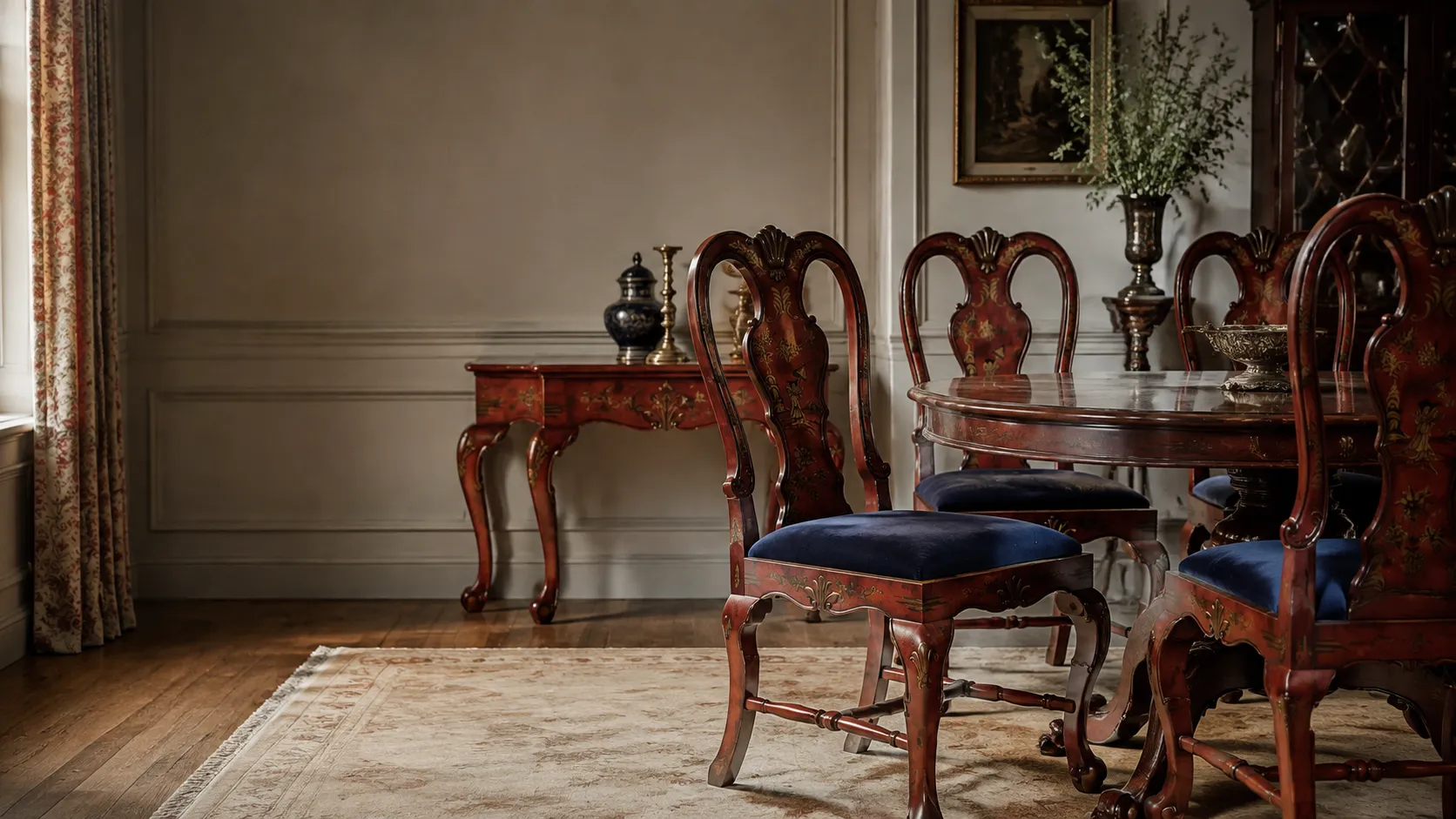
For Logan, a client in the UK, this was never just an order for eight chairs and a table. His dining room already carried the mood of an 18th-century English interior, with classical details, family portraits, and a strong sense of history. Any new furniture placed inside that room had to feel as if it belonged there.
The project began with a set of reference images and a clear request: create dining chairs and a matching table with the character of antique furniture, not the freshness of a newly made reproduction. From raised carving and hand-painted decoration to the depth of the vintage red finish, every detail had to be translated from style into craft.
Logan, a client from the UK, came to us with a very specific idea: a set of 18th-century inspired furniture for his home, including eight dining chairs and a matching table.
What made this project special was not the quantity. It was the level of taste behind the request.
Logan was not simply looking for “European vintage furniture.” His dining room already had a strong traditional English character, with family portraits, classical details, and a distinctly 18th-century atmosphere. Anything new placed in that room had to feel settled. It could not look too fresh, too decorative in a modern way, or like a contemporary chair wearing a historical costume.
The reference chair he shared had a clear classical vocabulary: a tall shaped back, curved back frame, shell ornament, cabriole-style legs, a red lacquered finish, hand-painted chinoiserie-style decoration, and the quiet weight of an older piece. For Logan, accuracy was not just about the outline. The furniture had to belong in the room.
In our early conversations, he described his interior as “very much 18th century.” That became the guiding direction for the whole project. We were not just copying a picture. We were making furniture for a room that already had its own historical voice.
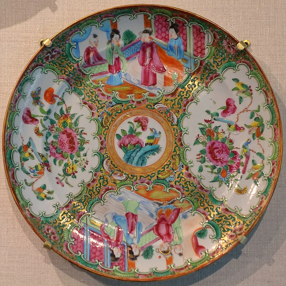
Chinoiserie-inspired decoration was not unusual in 18th-century European interiors. At the time, Chinese porcelain, lacquerware, hand-painted motifs, and East Asian decorative themes were widely admired in upper-class European homes. Logan also referred to 18th-century Chinese porcelain made for the European market, especially Famille Rose.
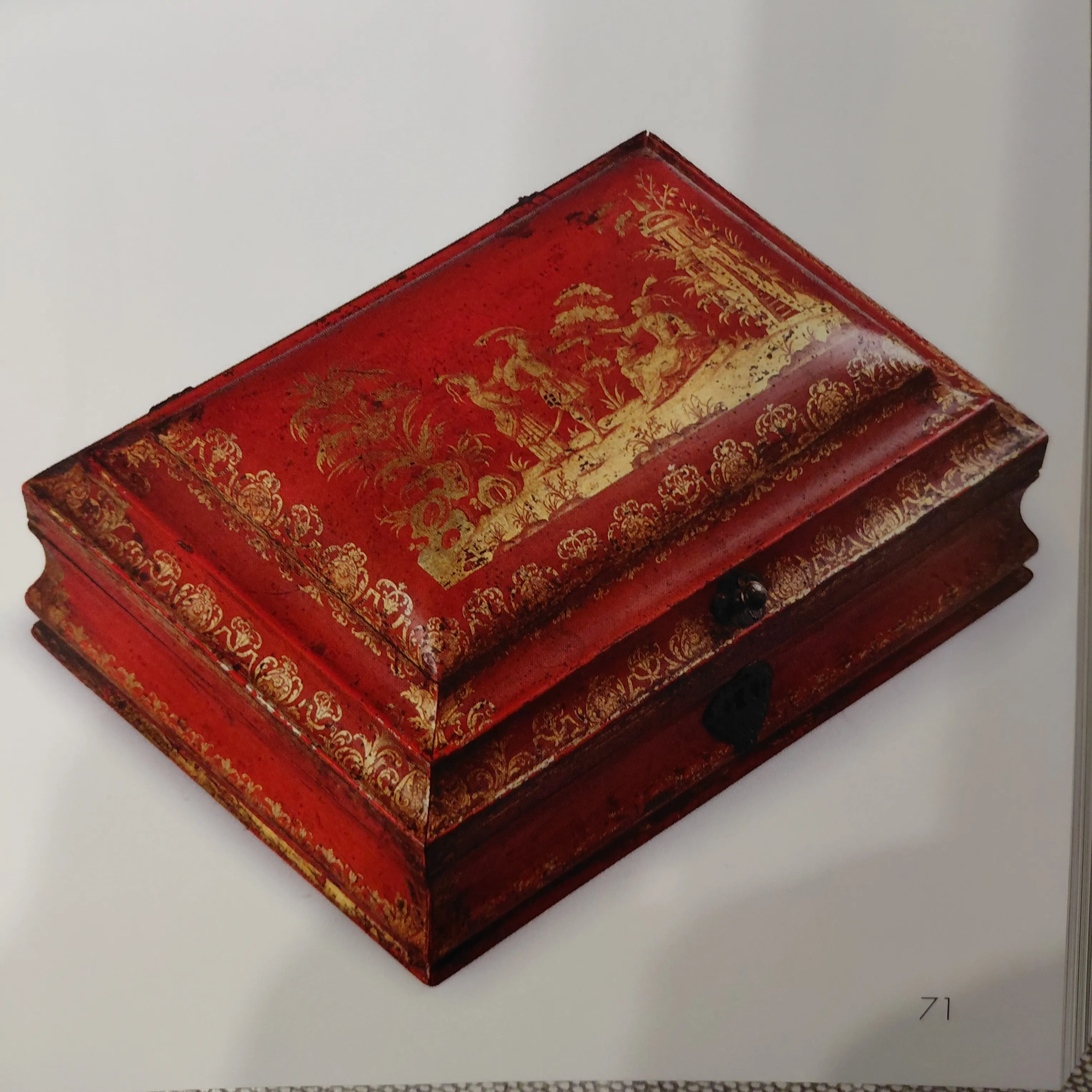
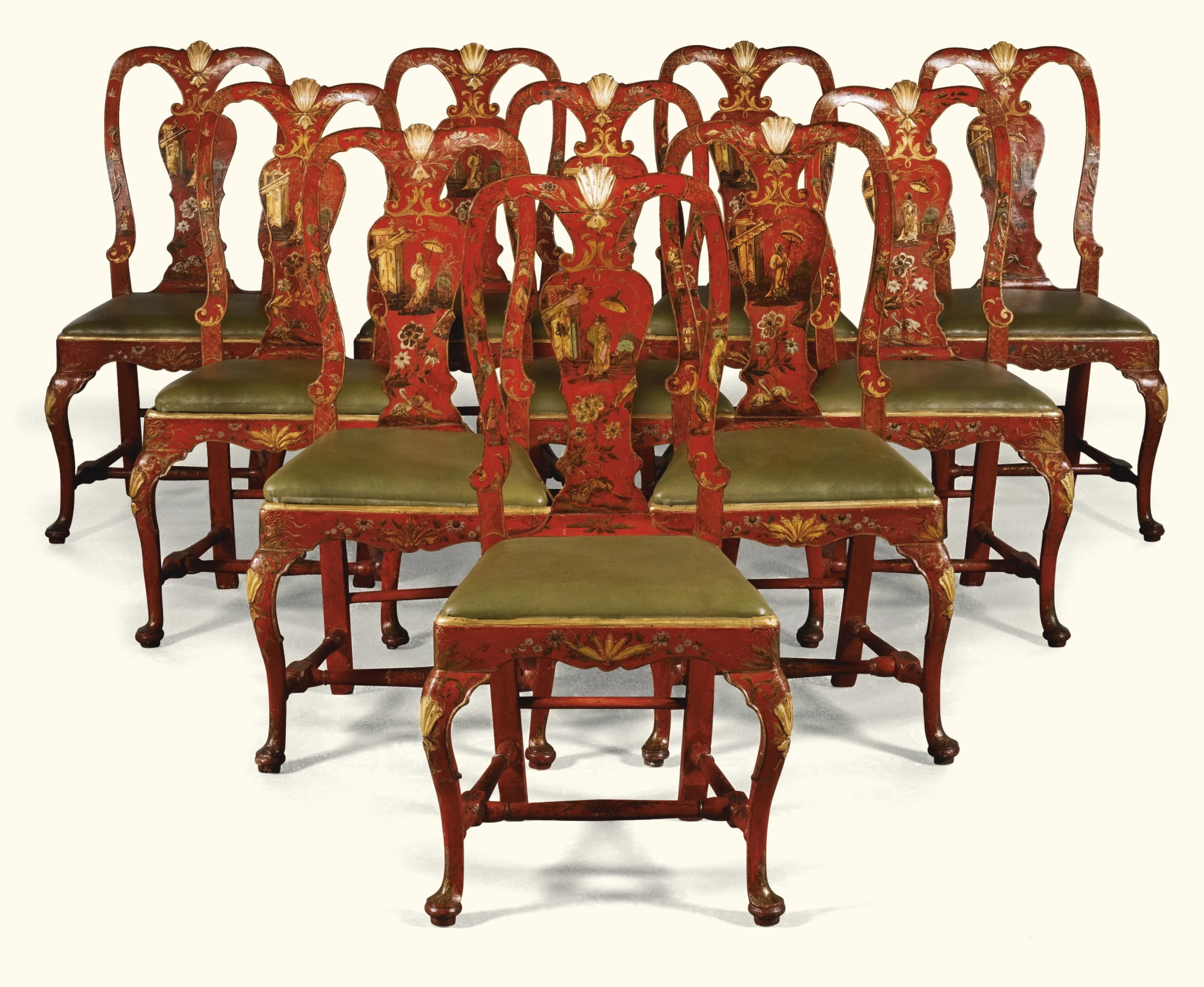
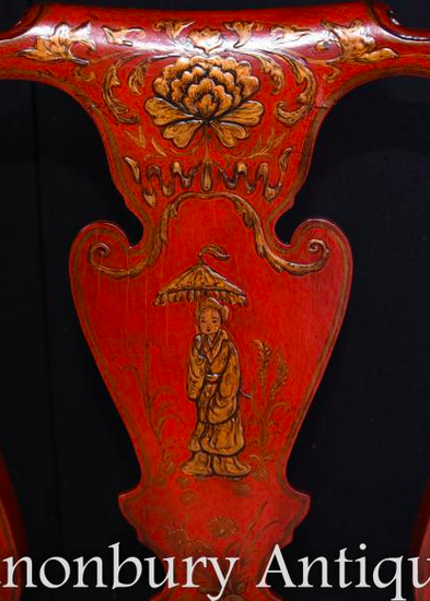
That reference told us a lot. He was not asking for a generic “Chinese pattern.” He was pointing to a very particular kind of refinement: soft color, delicate layers, natural handwork, and decoration that felt aged rather than newly applied.
Technical Tip:
What Is Famille Rose?
Famille Rose refers to a style of Chinese porcelain that became especially prominent from the 18th century onward and was often seen in export pieces made for Europe. Its beauty lies less in bold color than in softness, layering, and decorative richness. In this furniture project, it helped explain why the client cared so much about hand-painting, color depth, and historically informed decorative detail.
For a project like this, the first step is not production. It is translation. “18th-century feeling” has to become something a workshop can actually make: the curve of a chair back, the proportion of a leg, the red of the finish, the painted subject, the carved relief, and the degree of ageing on the surface.

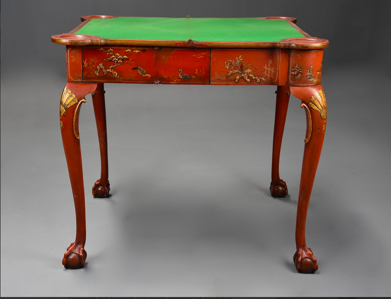
At the beginning, the reference images were not very clear, and some of the decoration on the chairs could easily have been read as painted detail. Once Logan sent clearer images, the team reviewed the details again and realized that much of the decoration was not flat paint. It was raised pattern, or relief carving.


Logan was very clear about this point:
“The decorations are raised carving on all 9 items.”
That changed the technical direction of the project. Hand-painting and relief carving are completely different processes, with different costs, timelines, and craftspeople involved.
Hand-painting is applied to the finished wood surface. Its strength is line, color, and pictorial detail. Relief carving, by contrast, has to be shaped into the wood or into the decorative element first, then sanded, finished, painted, highlighted, and aged. On curved areas such as chair backs, legs, and frames, the carving has to be visible without disturbing the structure or throwing off the proportions.
.jpg)
.jpg)
After reviewing the issue, Mira did not simply continue with the original quotation. She explained the difference clearly, checked feasibility with the factory engineers and carving specialist.
When a project moves from hand-painted decoration to relief carving, both cost and production time change. Mira updated the quotation and production lead time to the customer and commenced the subsequent work upon receiving confirmation.
Technical Tip:
Hand-Painting vs. Relief Carving
Hand-painting answers the question, “Does the motif look right?” Relief carving answers another question: “Does the piece have the right depth and shadow?” Much of the richness in classical furniture comes from light catching raised edges. Shells, scrolls, floral elements, and chair-frame borders lose a layer of presence if they are only painted flat onto the surface.
The original request included a card table. But when the team reviewed the proposed size, 110 x 50 cm, it became clear that this proportion would be narrow for an actual playing table. A traditional card table normally needs either a wider surface or an extending/folding structure, closer to 110 x 100 cm when opened.
After discussion, Logan agreed to refine the piece into a console table, or side table.
This did not weaken the design. It made the piece more coherent. The tabletop could retain its painted decoration and be used for dishes or display. The legs and sides could carry relief-carved ornament so the table still spoke the same visual language as the chairs. A large hidden drawer was added in the center, with no visible handle on the front.
That hidden drawer became one of the nicest functional details in the project. It preserved the classical appearance while adding practical storage. In a traditional interior, the more functional a feature is, the more quietly it needs to be handled.
Technical Tip:
Why the Table Worked Better as a Console
A true card table usually needs to account for a larger usable surface, often through an opening or folding top. At 110 x 50 cm, the piece made much more sense as a console table. Rather than forcing an awkward function, the design kept the client’s real priority: classical appearance, useful storage, and harmony with the chairs.
By late September, the team had prepared the first design drawings for the chairs and table. Once Logan reviewed them, he quickly pointed out several proportion issues: the seat depth was too deep, the seat height needed to work with his existing dining table, and the chair-back width and curves needed further adjustment.
The seat depth was a particularly useful point. Logan felt that 460 mm was too deep, even for a tall person, and that around 400 mm would be more comfortable.

_%E9%A1%B5%E9%9D%A2_1.jpg)
That kind of feedback showed that he was not only judging the chair visually. He was thinking about how it would sit in a real dining room and how it would feel in daily use. The drawings were revised accordingly, and the updated version marked the areas where raised relief carving would be applied, so both the client and the workshop could confirm the details on the same page.
Technical Tip:
Reproductions Still Need Ergonomics
With classical chair reproductions, it is easy to focus only on the silhouette. But seat height, seat depth, back width, and the relationship with the client’s existing table matter just as much. A chair can look historically convincing and still feel wrong if these measurements are not adjusted to the actual room and user.
By March 2026, the chairs and table were close to completion. When the first finished photos were sent, Logan liked the overall shape, but immediately pointed out the main problem: the furniture looked too new.
His feedback was direct:
“They look great except that they look as if produced yesterday!”
This is one of the hardest parts of classical reproduction furniture. The shape can be right, the color can be right, and the decoration can be right, but if the surface is too glossy, the color too clean, or the gilding too fresh, the piece will still feel out of place in an 18th-century style room.
Ageing a finish is not the same as making it dirty or darker. A convincing aged finish needs control over sheen, color layering, edges, shadows in low points, the restraint of gold details, and the overall sense that the piece has lived a little.
Logan suggested trying a varnish with a slight crackle effect. The team brought the idea to the workshop, but did not rush into a chemical treatment just for surface effect. Since these were newly made solid wood pieces, forcing a crackled chemical finish could affect the stability of the wood and coating.
Mira explained the trade-off clearly:
“Achieving the effect you sent last time would require chemicals, since this is a newly crafted piece, so we don’t recommend it.”
The team continued refining the vintage red instead: softening the sheen, adjusting the depth of the color, correcting shell ornaments and gilded details, and bringing the finish down from “newly made” to something calmer and more lived-in. In the final result, the chairs and table shared the same red tone and aged surface language, so the set felt ready for Logan’s dining room.
Technical Tip:
Ageing Is Not Distressing for the Sake of It
A good aged finish should feel natural, not damaged. Four things matter most: the main color should not be too bright; raised areas can carry a little wear; carved recesses should hold deeper shadow; and gilding should be softened so it settles into the finish rather than sitting on top of it.
The finished chairs were built around a deep vintage red, paired with dark fabric seats. The tall backs retained their shaped classical lines, with hand-painted chinoiserie-style scenes in the center, shell and floral ornaments near the top and frame, and cabriole-style legs below. The relief carving and aged finish gave the pieces stronger depth in natural light.
%20%E6%8B%B7%E8%B4%9D.webp)
The console table followed the same aged red finish. The tabletop kept its painted scene, while the legs and sides carried carved detail. The hidden drawer sat quietly within the front structure, without interrupting the historical appearance. On its own, the piece worked as a vintage-inspired console table. Placed with the chairs, it became part of the same dining-room story.
.webp)
.webp)
Classical furniture often fails when individual pieces look attractive but do not belong together. In this project, the goal was not to make one decorative detail stand out. It was to make the chairs, table, color, motifs, fabric, and room style feel like one coherent set.
After the furniture was confirmed, the project moved into packing and shipping. Logan wanted a practical shipping arrangement and was not in a rush for the fastest possible delivery. The team helped arrange a DDP consolidated shipping solution, with the goods delivered to the client’s designated local transporter in the UK. From there, Logan could arrange the final leg to his home.

Once the goods reached the UK transporter, Logan confirmed the arrival. He later needed the local proof-of-delivery document, so Mira continued following up with the logistics provider and forwarded the POD once it was available.
For cross-border furniture projects, delivery does not end when the goods leave the workshop. Production, packing, customs clearance, local delivery, and documentation all have to close properly before the client can truly relax.
This was not a simple “send a photo and copy it” order. The project involved a technical reassessment, a change from hand-painting to relief carving, a function change from card table to console table, drawing revisions, finish adjustments, and international delivery coordination.
Logan was not a client who would accept “close enough.” He understood the style and could tell when something felt wrong. That is exactly why the project is a strong example of high-end custom furniture service. The value was not only in sourcing or making the pieces. It was in helping a client turn a specific period, a specific room, and a very particular sense of taste into furniture that could actually be produced and delivered.

China, Shenzhen
Longgang, Jingji Yujing Age, 1808
Lunes a viernes de 9:00 a 18:00 (hora de China)